The Print That Ended the Conversation
A few years into my commercial work, I handed a client a set of framed prints from a brand shoot. She looked at them, then looked at me, and said, “These aren’t the colors I approved.” She was right. The images on her screen, on my screen at the time of delivery, and on the print lab’s output were three different interpretations of the same file. I had no defense, because I hadn’t built one into my process.
That conversation cost me a reprint, a discount, and about six hours of my life. It also permanently changed how I approach color in this business.
Calibration isn’t a luxury for finicky perfectionists. It’s the professional infrastructure that makes your output predictable, repeatable, and defensible when a client questions your work.
What Your Monitor Is Actually Doing to Your Colors
Every monitor ships from the factory with its own interpretation of what red, green, and blue look like. That interpretation drifts over time as the backlight ages. So even if your monitor was reasonably accurate out of the box, six months of daily use has already shifted things, usually toward warm yellow tones as the blue channel weakens.
When you edit on an uncalibrated screen, you’re compensating for a bias you can’t see. You might be pulling highlights down because your monitor makes them look hotter than they are. You might be adding warmth because your screen reads cool. The file saves those corrections, and when it hits a calibrated output device like a professional print lab, the corrections look wrong.
Calibration creates a shared language. Your monitor, your printer, your lab’s RIP software all speak different native dialects. A calibrated, profiled monitor with proper color management acts as the translator. ICC profiles are the grammar rules that let the translation hold.
The Hardware You Actually Need and What It Costs
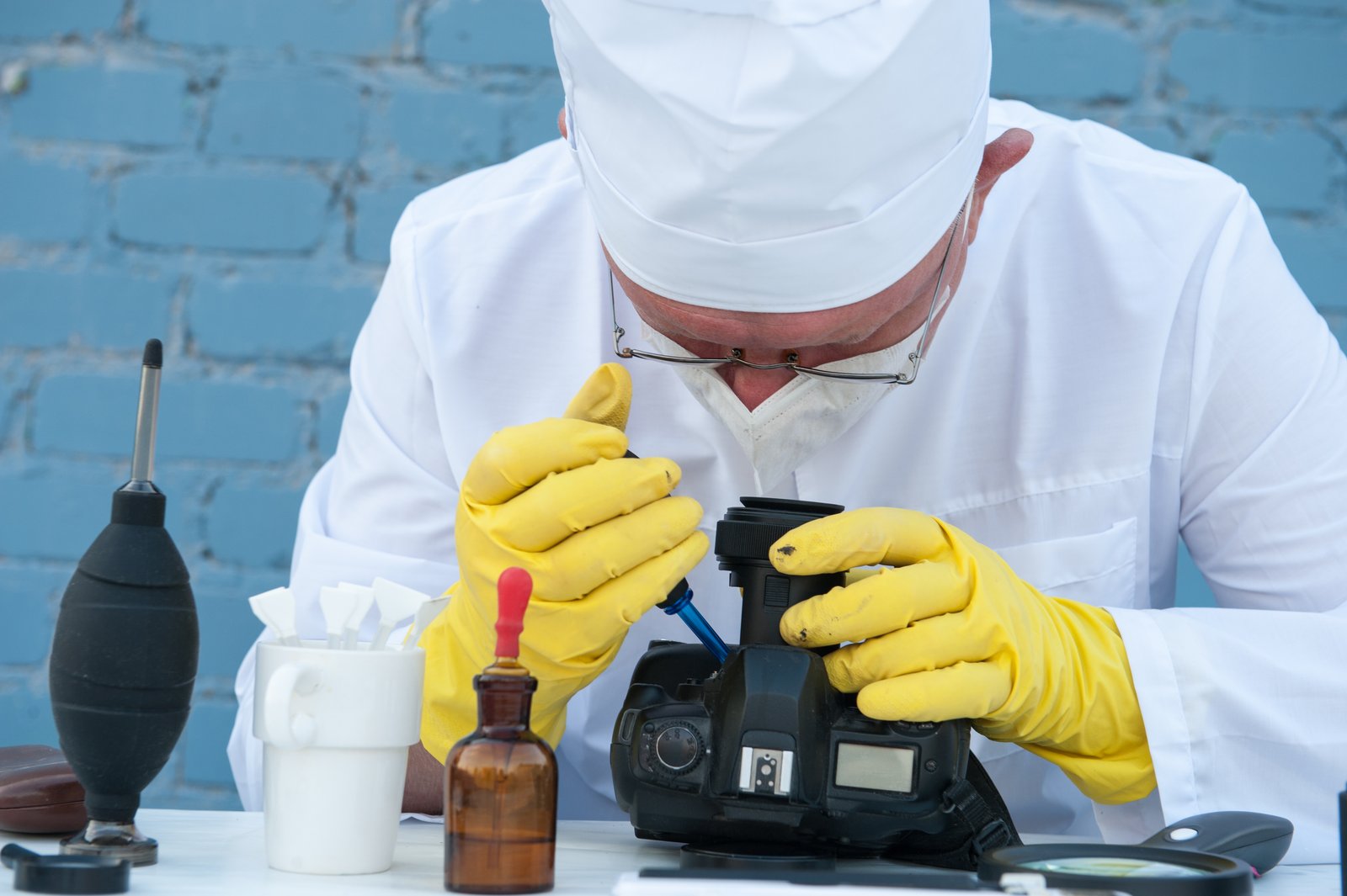
Software calibration tools built into your operating system are not the answer. They adjust the look table inside your graphics card, which affects everything on screen but doesn’t produce a usable ICC profile tied to the actual behavior of your display panel. You need a hardware colorimeter or spectrophotometer sitting on your screen measuring real light output.
The X-Rite i1Display Pro Plus runs around $270 and handles monitors up to a 10-bit panel. If you’re on a tighter budget, the Calibrite ColorChecker Display ($150) is a competent entry point for sRGB work. For anyone shooting product or fashion with serious print deliverables, the X-Rite i1Pro 3 spectrophotometer at around $1,600 gives you the full picture, including soft proofing profiles for specific paper stocks.
Pair the hardware with its bundled software. X-Rite uses i1Profiler. Calibrite uses CALMAN or their own ColorChecker software. Run the calibration in a dim room, not dark, and wait 30 minutes for your monitor to warm up before you start. Target D65 (6500K) white point and a gamma of 2.2 for standard photo editing. If you’re delivering primarily for web and screen, that combination covers 95 percent of what you need.
Recalibrate every two to four weeks. Set a recurring calendar reminder and treat it like backing up your drives. The whole process takes about 12 minutes once you’ve done it twice.
Color-Managed Editing and Soft Proofing
Calibrating your monitor is step one. Step two is making sure your editing software is actually using the ICC profile it creates.
In Lightroom Classic, go to Edit, then Preferences, and verify that the correct display profile is selected under External Editing. Photoshop picks up your system profile automatically, but confirm it in Edit, Color Settings. Set your working space to Adobe RGB (1998) if you’re delivering to print labs. Stay in sRGB if your output is exclusively digital and screen-based.
Soft proofing is where calibration pays its biggest dividends. In Photoshop, go to View, Proof Setup, Custom, and load your print lab’s ICC profile. Most professional labs publish their profiles for download. Bay Photo, WHCC, and Mpix all offer them. Enable Simulate Paper Color and you’re seeing an approximation of what your print will look like before you spend a dollar. Adjust your soft proof copy to compensate for any shifts, then send that version to the lab.
The first time I soft proofed a metallic print on Bay Photo’s Fuji Endura Metallic paper, I caught a shadow compression issue that would have made the print look muddy. Fifteen minutes of adjustment. Zero client surprises.
When the Lab Becomes Part Your Calibration Chain
Your workflow doesn’t end at your screen. The lab matters.
Order a calibration print from your lab. Most professional labs sell a standard test image file designed specifically for this purpose, often for $5 to $15. Print it, compare it against the soft proof on your calibrated display, and note the differences. You may need to adjust your soft proofing settings slightly or build a personal correction curve into your lab export preset.
I keep a printed reference strip taped to the side of my monitor stand. It’s a set of skin tones, a gray ramp, and a saturated color chart. Every time I’m finishing a client job, I hold the relevant prints from the previous similar job up next to my screen. It takes 45 seconds. It catches drift before drift becomes a client conversation.
Working at a newspaper, you didn’t get to call the press room and say the color looked off. The paper ran. The readers saw it. You either had a process that worked or you didn’t, and everyone knew the difference. Commercial photography operates the same way. A client can’t unsee a print that doesn’t match what they approved on screen.
Get a colorimeter, calibrate monthly, soft proof before you order, and build a physical reference print into your routine. That’s the whole system. Everything else is detail work inside a foundation that either holds or doesn’t.
Comments
Leave a Comment