Print Prep for Professionals: The Workflow That Saves Time and Protects Your Reputation
I’ve been shooting professionally for over two decades, and I can tell you with absolute certainty: the difference between good prints and great prints isn’t made in the camera. It’s made in the preparation. I’ve watched talented photographers lose clients over muddy blacks and blown highlights in prints, when the problem wasn’t their photography—it was their prep work.
If you’re serious about offering prints as part of your business, you need a bulletproof print prep workflow. I’m going to walk you through exactly what I do before any file leaves my computer.
Start with Proper Color Space Management
This is non-negotiable. Every image in my workflow is tagged with the correct color space from the moment I export from Lightroom. I shoot in sRGB for digital delivery and switch to Adobe RGB for print files. This isn’t arbitrary—Adobe RGB has a wider color gamut that translates better to professional printing, giving you richer colors in the final product.
When you export from Lightroom, embed your color profile in the file itself. Don’t trust it to travel separately. Under the Export dialog, I always verify “Embed Color Profile” is checked and set to Adobe RGB for prints. This one step has eliminated more color complaints than anything else I’ve implemented.
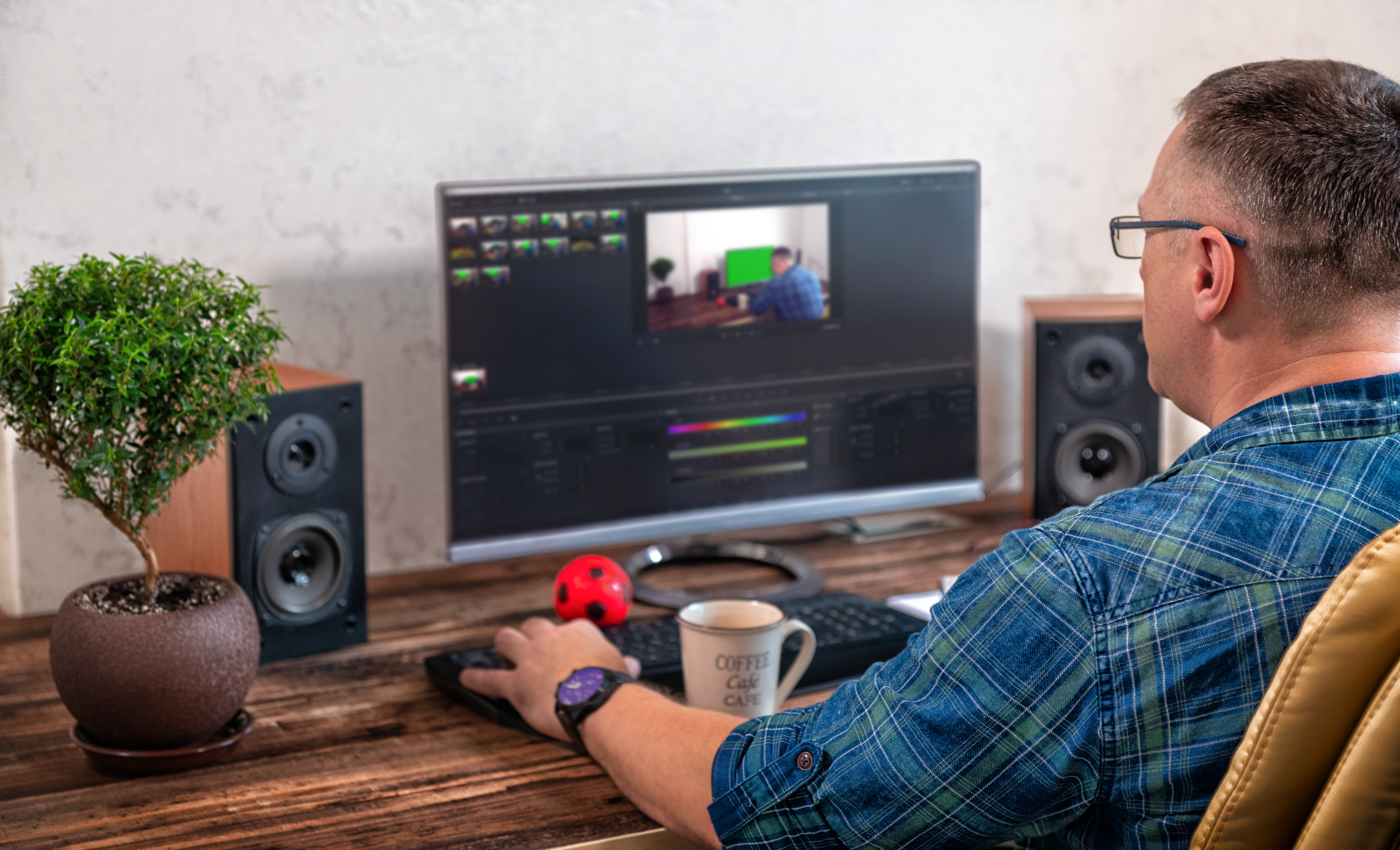
Calibrate Your Monitor (And Do It Regularly)
You cannot accurately prep print files on an uncalibrated monitor. Period. I use a Datacolor SpyderX Pro, and I calibrate every two weeks. Seriously. Your monitor’s colors shift over time—dust, temperature changes, aging panels—all of it affects what you’re seeing.
If you can’t afford a hardware calibrator yet, at minimum use your system’s built-in calibration tools monthly. But invest in the real equipment as soon as possible. It pays for itself in the first reprinted job you don’t have to redo.
Resolution and Sizing: Get the Math Right
I prepare print files at 300 DPI—never less. For standard sizes (8x10, 11x14, 16x20), I calculate the exact pixel dimensions needed and resize in Lightroom’s export settings rather than in Photoshop. This keeps my workflow efficient and prevents accidental downsampling.
Here’s what I do: multiply the desired print size in inches by 300. An 8x10 print needs 2400x3000 pixels. I verify the math before exporting. One miscalculation and you’re explaining to a client why their 16x20 looks soft.
Sharpen Specifically for Print
Screen sharpening and print sharpening are different beasts. In Lightroom, under the Sharpening panel, I use these settings for print: Amount 80-90, Radius 0.8-1.0, Detail 20, and Masking 30-40. These settings are conservative but effective—they enhance detail without creating halos or artifacts that become glaringly obvious in 16x20 prints.
If you’re using Photoshop, apply Unsharp Mask as your last step before saving, typically with Radius set to 1-2 pixels depending on the image content.
File Format and Delivery
Save print files as uncompressed TIFFs. JPEG compression is fine for digital display, but for prints, the loss isn’t worth the small file size savings. Name your files clearly—I use “ClientName_Date_PrintSize_RGB.tif”—so both you and your lab know exactly what they’re working with.
Send Test Proofs
Before committing to a full order, I always order a single 8x10 from whatever lab I’m using. This validates that my color settings, sharpening, and sizing work with that specific lab’s equipment and process. Lab quality varies significantly, and what looks perfect at one facility might need adjustment at another.
The Bottom Line
Print prep isn’t glamorous work, but it’s essential. I’ve built my reputation partly on print quality, and that reputation exists because I treat file preparation with the same care I give to the shoot itself. Take these steps seriously, and you’ll stop wasting money on reprints and start building a reputation for consistency that clients will recommend to others.
Comments
Leave a Comment